
Notice
Recent Posts
Recent Comments
Link
반응형
| 일 | 월 | 화 | 수 | 목 | 금 | 토 |
|---|---|---|---|---|---|---|
| 1 | 2 | 3 | 4 | 5 | 6 | |
| 7 | 8 | 9 | 10 | 11 | 12 | 13 |
| 14 | 15 | 16 | 17 | 18 | 19 | 20 |
| 21 | 22 | 23 | 24 | 25 | 26 | 27 |
| 28 | 29 | 30 |
Tags
- 캐드
- NAND회로
- 카메라 아이콘
- 플러터
- 처음 만나는 디지털 논리회로
- FLUTTER
- 둘만의 암호
- OrCAD
- 유니티
- 시뮬레이션
- 프로젝트
- 격자 모양
- level1
- 바텀바
- Python
- 논리회로
- 2d
- 크기가 작은 부분문자열
- 스택 파이썬
- 네비바
- 앱인토스
- 바텀네비게이션
- unity
- 코딩
- 프로그래머스
- BEAKJOON
- programmers
- 파이썬
- 그리드설정
- 백준
Archives
- Today
- Total
코딩하면솔솔잠옴
[Flutter] BottomNavigationBar (플러터 바텀 네비게이션 바) 본문
반응형
SMALL
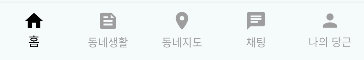
BottomNavigationBar
- 앱 하단에 위치하여 사용자가 앱의 주요 섹션을 빠르게 탐색할 수 있도록 돕는 UI 컴포넌트
주요 특징
- 메뉴 이동 담당
- 각 탭에 아이콘, 텍스트 라벨 제공
- 선택 상태에 따라 스타일 변경 가능
- fixed 또는 shifting 타입 제공
구성 요소
| 속성 | 설명 | 사용법 |
| currentIndex | 현재 선택된 탭의 인덱스 | currentIndex: _select |
| onTap |
사용자가 탭을 선택했을 때 호출되는 콜백 함수 | onTap: (index) { setState(() { _select = index; }); }, |
| selectedItemColor | 선택된 아이템의 색상 | selectedItemColor: Colors.black, |
| unselectedItemColor | 선택되지 않은 아이템의 색상 | unselectedItemColor: Colors.grey, |
| type | 네비게이션 바의 타입 fixed: 아이콘 크기 고정, 라벨 선택 유무 상관없이 보여줌 shifting: 선택 시 크기 변화, 선택 시 라벨 보여줌 |
type: BottomNavigationBarType.fixed, |
| items | 네비게이션 항목 목록 | items: const [ BottomNavigationBarItem(icon: Icon(Icons.home), label: '홈'), BottomNavigationBarItem(icon: Icon(Icons.feed), label: '동네생활'), BottomNavigationBarItem(icon: Icon(Icons.place), label: '동네지도'), BottomNavigationBarItem(icon: Icon(Icons.chat), label: '채팅'), BottomNavigationBarItem(icon: Icon(Icons.person), label: '나의 당근'), ], |
      bottomNavigationBar: BottomNavigationBar(
          type: BottomNavigationBarType.fixed,
          selectedItemColor: Colors.black,
          unselectedItemColor: Colors.grey,
          currentIndex: _select,
          onTap: (index) {
            setState(() {
              _select = index;
            });
          },
          items: const [
            BottomNavigationBarItem(icon: Icon(Icons.home), label: '홈'),
            BottomNavigationBarItem(icon: Icon(Icons.feed), label: '동네생활'),
            BottomNavigationBarItem(icon: Icon(Icons.place), label: '동네지도'),
            BottomNavigationBarItem(icon: Icon(Icons.chat), label: '채팅'),
            BottomNavigationBarItem(icon: Icon(Icons.person), label: '나의 당근'),
          ],
      ),
상단 그림자 추가

      bottomNavigationBar: Container(
        decoration: BoxDecoration(
          boxShadow: [
            BoxShadow(
              color: Colors.grey.withOpacity(0.1),
              blurRadius: 1,
              offset: Offset(0, -1),
            ),
          ],
        ),
        child: BottomNavigationBar(
        ... 이전 코드들
전체코드
import 'package:flutter/material.dart';
import 'home/home_screen.dart';
import 'chatting/chatting_screen.dart';
import 'myCarrot/my_carrot_screen.dart';
import 'neighborhoodLife/neighborhood_life_screen.dart';
import 'neighborhoodMap/neighborhood_map_screen.dart';

class BottomNav extends StatefulWidget {
  const BottomNav({super.key});

  @override
  State<BottomNav> createState() => _BottomNavState();
}

class _BottomNavState extends State<BottomNav> {
  // 현재 선택된 탭의 인덱스
  int _select = 0;
  // 각 탭의 화면(위젯) 리스트
  final List<Widget> _bottomList = [
    HomeScreen(),
    NeighborhoodLifeScreen(),
    NeighborhoodMapScreen(),
    ChattingScreen(),
    MyCarrotScreen(),
  ];

  @override
  Widget build(BuildContext context) {
    return Scaffold(
      body: _bottomList[_select],
      bottomNavigationBar: Container(
        decoration: BoxDecoration(
          boxShadow: [
            BoxShadow(
              color: Colors.grey.withOpacity(0.1),
              blurRadius: 1,
              offset: Offset(0, -1),
            ),
          ],
        ),
        child: BottomNavigationBar(
          type: BottomNavigationBarType.fixed,
          selectedItemColor: Colors.black,
          unselectedItemColor: Colors.grey,
          currentIndex: _select,
          onTap: (index) {
            setState(() {
              _select = index;
            });
          },
          items: const [
            BottomNavigationBarItem(icon: Icon(Icons.home), label: '홈'),
            BottomNavigationBarItem(icon: Icon(Icons.feed), label: '동네생활'),
            BottomNavigationBarItem(icon: Icon(Icons.place), label: '동네지도'),
            BottomNavigationBarItem(icon: Icon(Icons.chat), label: '채팅'),
            BottomNavigationBarItem(icon: Icon(Icons.person), label: '나의 당근'),
          ],
        ),
      ),
    );
  }
}
반응형
LIST
'Project > Flutter' 카테고리의 다른 글
| [2026] 앱인토스 플러터(Flutter) 출시하기 - ait 번들 생성 (0) | 2026.05.05 |
|---|
'Project/Flutter' Related Articles
more

Comments